
Table of contents
- What types of logos exist?
- What should a good logo meet?
- When is it time for a new logo?
- Why a professionally designed logo is essential
- How we design logos that do more than just look pretty
- What does a logo design cost?
- Common logo design mistakes and how to avoid them
- Having a logo designed vs. branding: what's the difference and when do you choose what?
What is a logo anyway?
A logo is the visual essence of your brand: a landmark that shows at a glance who you are. It is not a decoration, but a strategic communication tool. A strong logo evokes emotion, makes you stand out in the market and provides recognition at times when you only have a split second to make an impression.
A logo usually consists of a combination of shape, typography, color and composition. But the power is not in the individual elements; it is in the meaning they convey together. The logo is the anchor of all brand communication, online and offline. A good logo:
- Tells a story without words
- Activates brand associations
- Works in any format and application
- Remains recognizable in color and black and white
- Supports the brand identity rather than overstating it
So it's not just a visual mark, but a tool that carries your brand identity.

A logo that moves your brand forward?
And gives direction to your organization? Then we would like to get to know you.
What types of logos exist?
Within professional logo design we distinguish a number of logotypes. Not one is "better" the choice depends on the brand strategy.
Word mark (logotype)
The brand is built entirely from typography. Suitable when the name itself is strong and distinctive.
Image mark (icon or symbol)
A visual symbol that represents the brand, such as Apple or Nike. Very powerful, but requires strong brand recognition.
Combination brand
Text + symbol. The most flexible form because you can vary in different contexts.
What should a good logo meet?
A professional logo adheres to a set of design principles that ensure staying power:
Recognizable
A good logo has a unique silhouette that you instantly recognize even when you see it fleetingly or in small size.
Timeless
Trends come and go, but a strong logo lasts for years. Timeless design prevents your brand from feeling outdated quickly.
Scalable
A logo should work as a favicon, on social media, on print, signage and in large digital applications. Some logos lose power on small screens; that should never happen.
Functional use of color
Color supports a logo, but should never make it dependent. A good logo remains strong in black and white, monotone and high-contrast variants.
Relevance
The logo must match the personality of the brand. A collection agency requires a different visual language than a creative consumer brand.
When all of these elements are balanced, it creates a logo that will last for years.
When is it time for a new logo?
Organizations reach the point at various times when their logo no longer fits:
- As the brand grows or takes a new direction
- If the target population changes or expands
- As competitors position themselves more strongly
- If the current logo is outdated or unclear
- If the design does not work well in digital environments
- If different departments or teams use the logo inconsistently
A new logo won't solve everything, but it will help you regain direction, create clarity and step out with more confidence.

Need a new logo or identity? Get in touch
Why a professionally designed logo is essential
A logo is often the first thing people see of your brand. It tells something about personality, quality, reliability and style within a split second. If that story doesn't ring true, you'll lose customers before you've had a chance to explain yourself. A professional logo:
- Makes your brand instantly recognizable
- Creates a consistent basis for all communications
- Stand out in a crowded marketplace
- Contributes to trust and professionalism
- Supports growth, scalability and new propositions
Many organizations come to us because their existing logo no longer works. It doesn't fit the current positioning, doesn't match the target audience, or is difficult to apply in modern digital environments. We help reestablish that foundation. Clear, future-proof and strategically based.
This is what clients think of our logo designs
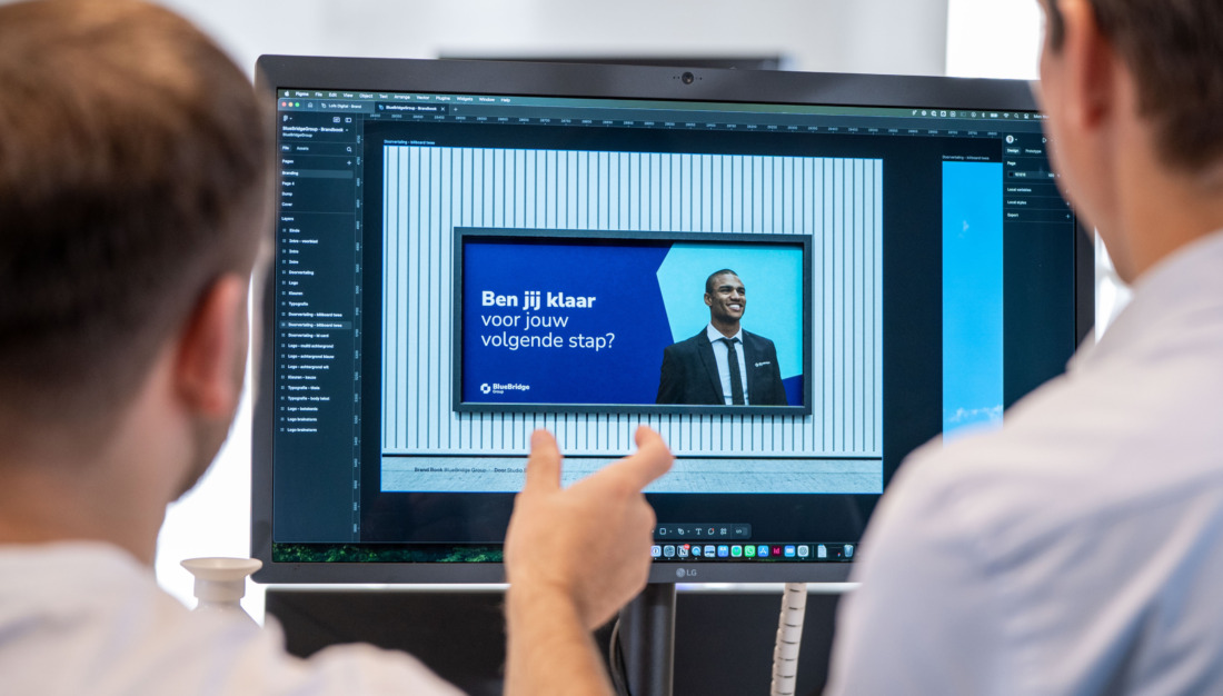
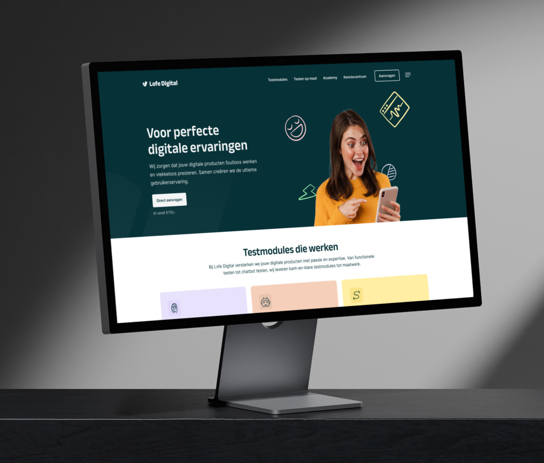
Studio Brabo, thank you for developing a beautiful new corporate identity for Lofe Digital with matching website. Very happy with the end result, great service and quick and clear communication. Top!

Raphael Bruggeman
Director at Lofe Digital
Studio Brabo performed a complete rebranding with us. They changed our corporate identity and the design of our expressions. Once the foundation was in place, they also reflected this in a new website. We are very happy with the final result and very satisfied with the pleasant cooperation. Top!

Kevin Rooijakkers
Senior Associate at Mister Finance
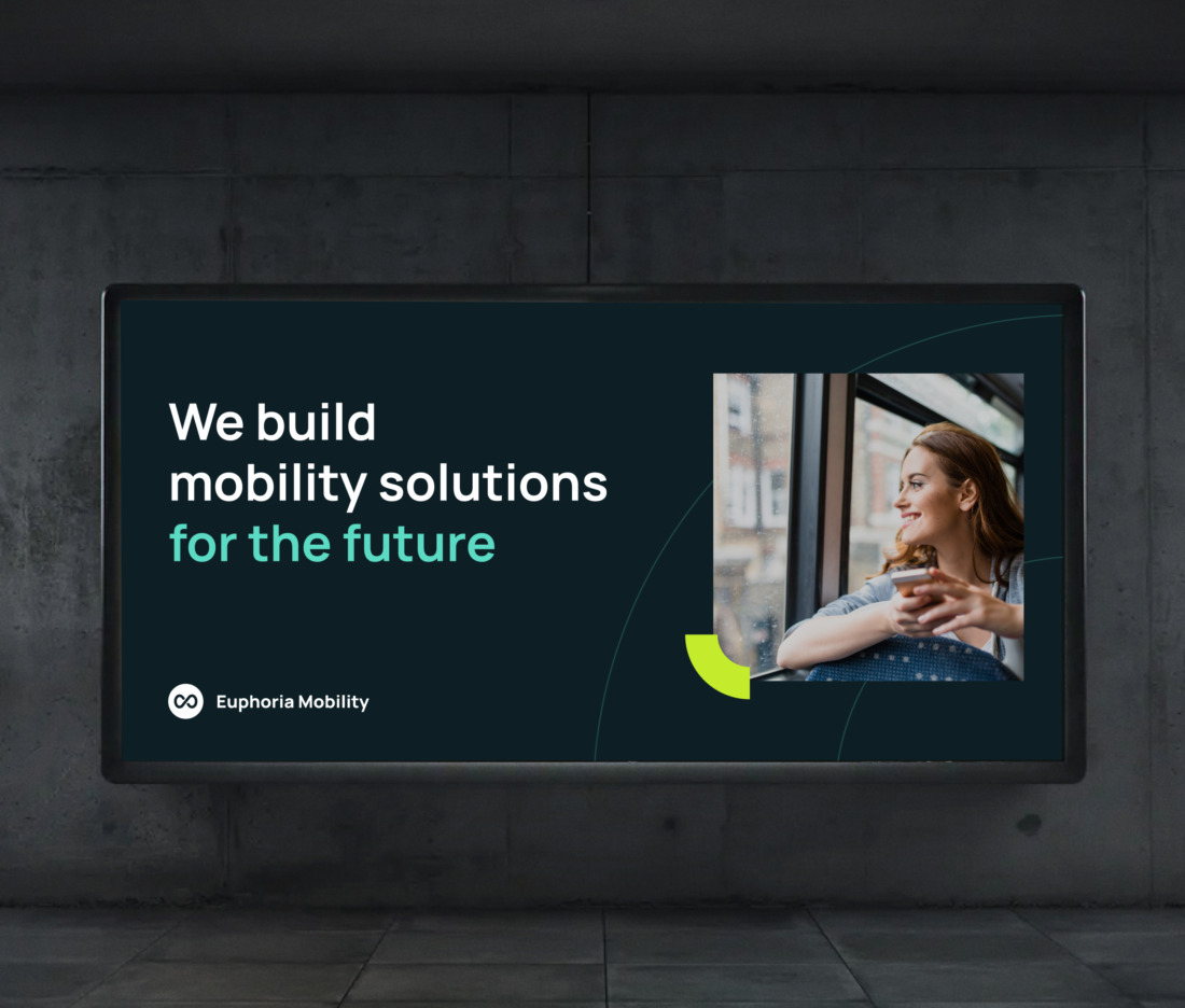
Studio Brabo is highly recommended if you are looking for a professional internet agency. They think along with you and the communication is flawless. In addition, they are very creative and have provided us with a whole new corporate identity. We are very satisfied!

Sophie de Kok
Marketer at Euphoria Mobility
How we design logos that do more than just look pretty
We don't believe in logos that are only visually appealing. Every design we create must stem from a thoughtful strategy. That's why we always start with your brand: what you promise, what you stand for, how you are different and what your target audience needs to choose. Only then do we start designing.
Our approach consists of four core elements:
1. Get brand fundamentals clear
We examine positioning, target audience, competition and brand personality. This forms the compass by which we determine direction. After all, a logo shouldn't just be pretty, it should match who you are - and where you're moving.
2. Concept development from strategy
Based on the foundation, we develop multiple conceptual directions. No loose sketches, but visual translations of your brand values. We present options with clear substantiation, so that choices are never arbitrary.
3. Design that is both functional and scalable
A logo does not live in a vacuum. It must function in digital interfaces, on social media, in applications, print, signage and sometimes even on vehicles or clothing. That's why we develop variations for every application: compact, horizontal, vertical, dark, light and scalable to any size.
4. Capture in a clear brand guide
A strong logo only works if it is applied consistently. That's why we always provide a compact but complete brand book, defining color usage, typography, spacing, minimum size and application. This prevents confusion and ensures a professional look in the long run.
What does a logo design cost?
The investment depends on the scope of the assignment: logo development only, logo + basic identity or a full (re)branding. As an indication:
- Logo + basic style: €1,500 - €3,500
- Logo + extensive corporate identity + brandbook: €3,500 - €7,500
- Complete rebranding: starting at €7,500
During an introductory meeting we determine which approach suits your ambitions and prevents you from investing too much or too little.
Logos that help organizations grow
Common logo design mistakes and how to avoid them
Many logos are not poorly designed, but strategically awkward. They limit brands instead of giving them space. These are the mistakes we see most often:
1. Too complex or too decorative
Logo details that are beautiful on a large canvas, but disappear on mobile or as a social avatar.
2. No clear brand strategy beforehand
A logo without positioning is loose design, without meaning or distinction.
3. Trend-sensitive design
Swooshes, gradients or hype styles that are dated within 2 years. A brand should grow, not chase a trend.
4. Insufficient contrast or poor color application.
Colors not accessible or become unusable in some situations (e.g. dark mode vs. light UI). Or are not printable.
5. No scalability
The logo works on the homepage, but not on a pen, an app icon or LinkedIn. A good logo should "stay put" in any format.
6. Too rigidly designed brand
Logos that may only be used "in exactly one way," leaving marketing teams bogged down in social formats, campaigns or motion.
7. No guidelines or inconsistent implementation
Even a good logo loses power without clear rules for typography, color, spacing and applications.
Good logo design is not just about aesthetics, but about functional simplicity + strategic clarity.
Frequently Asked Questions
Clear answers to frequently asked questions. Short, concrete and up-to-date for SEO and AI assistants.
On average, 2 to 4 weeks. This depends on feedback rounds and the complexity of the brand.
Yes. We present multiple strategic directions, with clear rationale and examples.
Yes. A logo works best as part of a strong brand identity. We help with corporate identity, branding and content.
Yes. You will receive files for web, print, social and responsive use (including SVG, PNG, PDF and variants for light and dark).
Sure. We regularly perform rebrandings and brand refreshes. Recognizability is maintained where possible, with better quality and applicability.
Having a logo designed vs. branding: what's the difference and when do you choose what?
A logo is an important part of your brand, but it is not the brand itself. Many organizations start with a loose logo design, but then run into the same challenge:
"The logo stands, but it doesn't feel like the brand is right."
That's because a logo is just one building block of a complete brand identity.
A logo design focuses on:
- Form, color and typography
- Recognition
- Basis of visual identity
A branding process focuses on:
- Positioning
- Brand values & personality
- Tone of voice
- Visual identity (of which the logo is a part)
- Consistent application across all channels
In short: A logo is what you see. And branding is what people feel, remember and recognize.
This is why we recommend a branding process in almost all cases. Not because a logo is not important, but because the design simply becomes much better and more strategic when the fundamentals of the brand are clear.
A branding process:
- Provides direction before designing
- Makes the logo more relevant, timeless and functional
- Prevents having to start over within 2 years
- Creates a consistent foundation for website, social, campaigns and employer branding.
Want a logo that really works and isn't just pretty? Then start with a broader brand foundation. The logo follows logically from that.