A brand that exudes digital quality
Strong branding starts with strategy. Together with Lofe Digital, we dove into their positioning: how do you want to come across, who do you want to appeal to and what makes you different? We translated these insights into a visual identity that breathes digital quality.
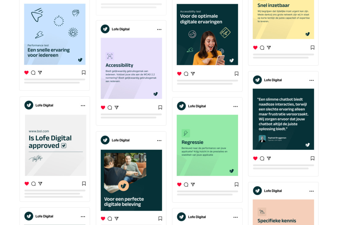
The style is professional and modern, but also includes playful elements - such as hand-drawn icons and illustrations. This makes the brand feel accessible and approachable, without compromising on trust. Everything comes together in a clear brand book. This gives Lofe a strong foundation for all communication - now and in the future.
Client
Lofe Digital, Zoetermeer
Website
Sector
Focus market
National
Services


Complex info, brought clearly
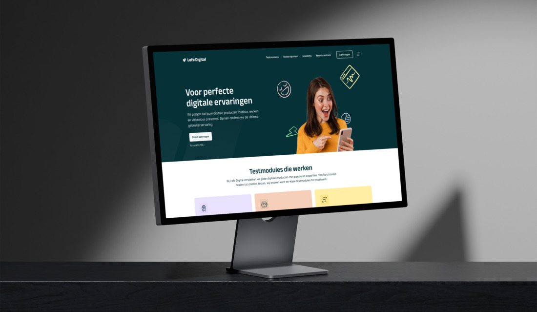
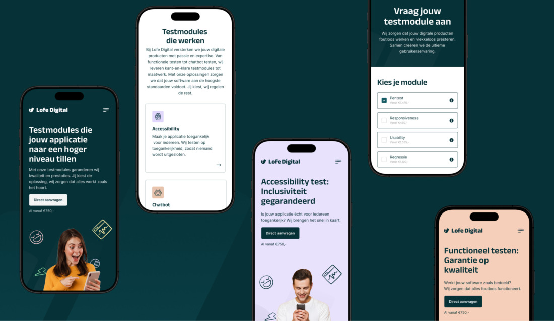
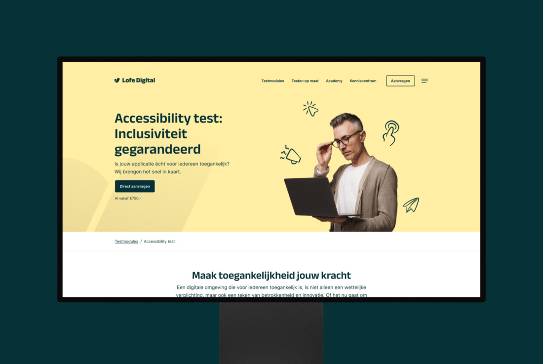
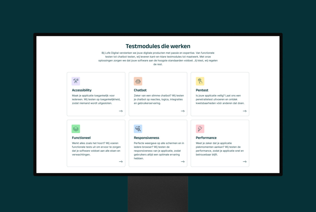
Lofe Digital helps organizations with smart testing solutions. But what, for example, is regression testing? And why should it be on every software team's agenda? On the new site, we explain that in understandable language, with clear illustrations and step-by-step plans.
This is how we make technical content accessible and relevant. And that doesn't stop with explanation alone: we lead visitors in a targeted way to Lofe's practical solutions, such as the clear test modules. Visitors can view and request these directly online.

Getting started with your brand?
I'm Bob, digital strategist and happy to advise you.
Studio Brabo, thank you for developing a beautiful new corporate identity for Lofe Digital with matching website. Very happy with the end result, great service and quick and clear communication. Top!
 Raphael Bruggeman Director at Lofe Digital